A recent trip to a farmers market actually provided a great analogy to good vs. bad user experience concepts... and also demonstrates the power of organized categories.
There were two farmers across the aisle from each other, each selling roughly the same types of things. They each had different types of carrots, tomatoes, onions, potatoes, lettuce, citrus and nuts.
Booth #1
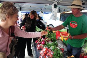
The first booth had a little display up front featuring each type of produce. Then in back of the table he had a bunch of different crates and piles of the produce where the vegetables were all mixed together.
The booth owner often had to explain to people that they were allowed to walk around the table and search through the crates and piles for whatever they wanted… but almost no one did. As customers walked up, they opted to tell the farmer and his assistant what they wanted and then waited for their order to be bagged and weighed. Then, they paid. It didn't occur to the booth owner that his set up was somehow broken, but from an observers perspective it was easy to see that his set up, although initially pleasing to the eye, sort of confused people.
Booth #2
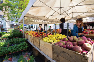
The second booth put out multiple tables creating aisles. Each aisle had crates and piles of a specific type of vegetable. Nothing was displayed in any fancy way. However, each type of produce was separated into a either a crate or pile of the same type. All of the vegetables were made easily accessible for people to grab what they wanted and take their order to the weigh and pay station.
As I watched the two booths it became clear that while people liked to look at the nice display the first farmer had put on the table, they didn’t seem to like digging through the mixed up vegetables to find what they wanted and they didn’t want to wait in line.
Meanwhile, because people could easily find and take what they wanted at the other stand, the second farmer was doing more than twice as much business.
This spoke volumes to the benefit of organizing content with like content, and making it readily accessible through clear navigation. It also made it easy to understand that the more self-service your business model is, the easier it will be to scale the business. Organization and easy self serve access are keys to a successful user experience and more sales.
If the information on your website isn’t separated into proper categories that follow a specific theme, the information will seem disorganized. If your site navigation isn’t intuitive and simple, most visitors won’t stay around long enough to figure it out. If your site puts up barriers that force the user to contact someone before they can get the information that they are looking for... the lower your conversion rates will be.
This also relates to Google and how an organized collection of related content provides strong evidence that a website offers depth and breadth in a given subject. A website that features one page on a particular subject probably isn’t as good of a resources as a website that offers 20 pages of content that are all related to that same subject. But, how does Google know if your pages are all about different aspects of the same subject? You can accomplish this by placing them into them all into a category so that the URL structure indicates that they are grouped together, and by creating a sub-navigation menu that interlinks the pages in that section. Also, the content on each page should utilize language that is strongly related… but we’ll get into that topic in greater depth in the course “Highly Optimized Content – How to plan, create, optimize and market every type of content”.
Key Takeaway #1
Figure out the best way for people to serve themselves. The less involved you and your staff can be in the process of customers buying your products and services... the more customers will buy your products and services. It will be easier to run your business and you will make more money. I know that this seems like a simple concept, but there are so many businesses that could be implementing self serve models and have yet to try.
Key Takeaway #2
Don’t leave it to Google to figure out how to organize your content for you. When a website makes it easy for Google to understand the depth and breadth of content that it offers about a given subject, Google rewards that site with better rankings.
Ultimately, if you do a great job of organizing your content and providing clear navigation paths, your users will have a better experience and a lot more of them will become profitable customers.
So, Now That We've Done A Nice High Level Overview
Let's Dig Deeper!
Next In the next lesson we will tackle some of the tougher information architecture issues and take another real world example (this time straight from mother nature) to demonstrate perfect information categorization. Let's make sure you are