
The key to great navigation is combining the principals of a good link structure with great design. In this lesson we will take a look at the five major types of site navigation, the linking principals behind them and some design examples.
Header navigation is the main navigation menu for a site. Typically header navigation is “global” meaning that the same header navigation will appear on every page of the site. However, in some instances the header navigation may change from section to section. For instance, you homepage and top level categories may feature one header navigation menu while your blog or store features a different header navigation menu. You may want to get rid of the header navigation completely from some pages such as during sign-up, contact forms, or in the checkout process.
The goal of a good header should not necessarily be to link to every single page on the site, remember that you should try to limit the total number of links on any single page to no more than 100, this includes navigation menus such as your header, footer and sub-nav. Therefore, the header navigation should simply provide visitors with access to the top level categories and perhaps the top sub-categories for every section on your site.
This can easily be accomplished with two different types of header navigation, drop down menus and mega menus. Here are a few examples of each:
Drop Down Menus
The following two examples are good uses of drop down header navigation.
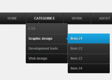

When using a drop down header navigation, make sure to label items appropriately, make sure that the links all have title tags, and try not to go more than two levels deep with the sub-navigation. By providing two levels of depth within a drop down menu, users can actually get three levels deep within your URL structure. For instance, if you were to click on a menu link that is similar to the one jutting out to the right of the drop down navigation menu like in the examples above, you could end up at:
http://www.website.com/category/sub-category/destination-page
The above page is 3 indexes deep, and easily accessible from the homepage or any other page on the entire site. That is an example of the power of drop down menus and why they are so popular.
However, the can be a darker side to drop down menus. If you attempt to expand a drop down menu beyond two levels, things can get out of control quickly, as in the following example:
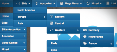
There are a few big problems with allowing a drop down navigation menu to expand more than two levels. The first is a design problem, it is simply ugly and will likely cover up more desirable elements of your page. The second is a user experience problem. In order to successfully navigate the above menu, the user must be highly skilled with a mouse, and the slightest error of moving your cursor off of the menu while trying to navigate the path will cause the entire menu to disappear, which is very frustrating. The last problem is that drop down menus don’t always play nice with touch screen devices.
If you are going to use a drop down menu, do your users a favor and keep it to no more than two levels of depth.
Mega Menus
Mega Menus are a very popular header navigation design trend because they are very easy to navigate and are able to provide great navigational depth without the user experience problems that drop down menus can cause. Mega menus are especially popular with very large sites. Here are some examples:
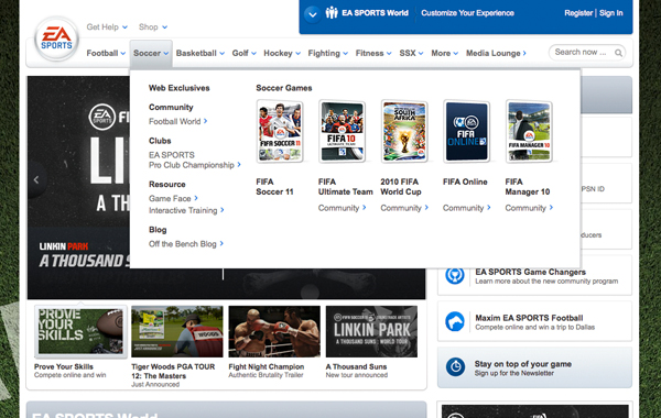
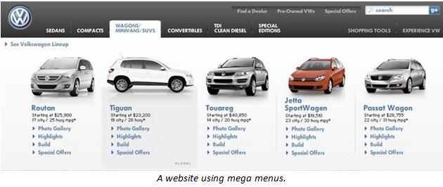
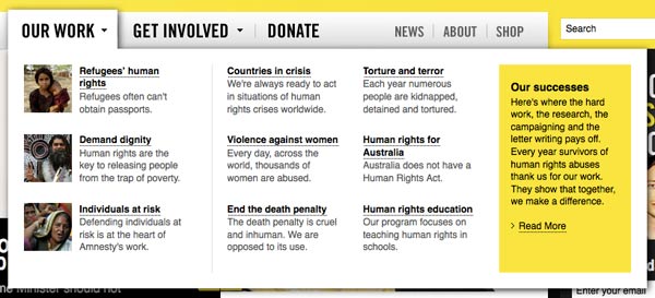
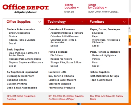
The most common problem with mega menus is that they tend to cause sites to greatly exceed the recommended limit of 100 links per page. For very large sites, with strong brands and lots of credibility like the ones featured above, the acceptable number of links per page can greatly exceed 100 because the sites have enough authority and strong enough backlink profiles to support that level of link distribution. However, smaller and less authoritative sites should keep the 100 link limit in mind when implementing mega menus.
Sub-navigation menus are specialization menus designed to support a specific section of a website and help users quickly explore the content of that section in greater depth than would be appropriate in the global header. The following four examples show very interesting uses of sub-navigation:
Geico
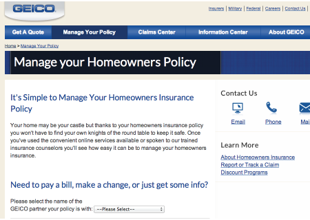
Notice the “Learn More” sub-navigation in the right sidebar. This is the most common for smaller sites. The idea is to give users simple access to more information that is directly relevant to the page that they are on.
Nike
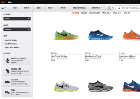
Nike uses their sub-nav to help suggest additional categories of products that are specifically related to the current page.
Apple

Apple’s sub navigation appears just below the header navigation, follows their minimalistic design aesthetic and suggests specific products that are related to the chosen category.
Guitar Center
Guitar center uses left sidebar sub-nav to help the visitor further refine their search. This is essentially an advanced search feature where by checking the desired boxes the products that are being displayed are dynamically filtered to meet the visitor’s requirements.
Footer navigation is typically global, appearing on every page throughout the site. Footer navigation is also typically used to feature pages that are important but not heavily trafficked, such as the Privacy Policy or Terms of Use that should be accessible from every page. Footer links are also often used to promote a few of the most popular pages on the site such as the blog, contact us, sitemap and specific locations. Footer navigation is also often used to display the physical address of the business and social profile links to Facebook, Twitter, LinkedIn, Google+, Pinterest, etc.
Contextual cross-links are possibly the most important types of links that you can utilize on your site, and they are also the type of links that are most commonly overlooked. A contextual cross-link is a link that appears in the body text of a page and points a link to another page. These links should be utilizing anchor text that is a match for one of the target keywords of the page it is pointing to. These links should also have a title tag matches the same anchor text/keyword. However, beyond the basics of the information and links provided in footer navigation, this is an opportunity to illustrate the creative side of your business as well with visual cues demonstrating relevance and attitude.
The idea behind contextual cross links is that when you are writing some content and you happen to mention a term or phrase, and you have another page on your site that goes into greater depth and detail about that terms or phrase, you should provide a link to that page so that if the visitor wants more information on that subject so they can follow the link. So, these links offer a great benefit to the user experience and are a great way to build links to the deeper pages of your site.
However, these links also provide the page they are linking to with three great SEO benefits.
First, these links pass PageRank, therefore, the more links you point to a certain page, the more important that page will appear to search engines.
Second, the anchor text and title tag associated with the link provides search engines a clue about the subject matter of the page that is being linked to.
Third, Google also take relevance clues from the content that immediately surrounds a link. For instance, if you are talking about off-road truck driving and you mention off-road tires, you may want to turn the term “off-road tires” into a link to your category page that features your selection of off-road tires, or perhaps to an article that goes into depth about off-road tires. However, if your page is about prom dresses, and you include a link to a page about off-road tires, Google could see that as link spam. Therefore it is critically important that you keep your links coming from relevant content.
Another rule of thumb for contextual cross-linking is to keep it to one link per 100-150 words of content.
Dynamic menus are awesome! These help your site automatically create tons of relevant cross links, while also supporting a more personalized user experience throughout your site. These are menus that are automatically generated and automatically updated where you either add or change content. The automation aspect of these menus make them fantastic for website administrators. However, they can also significantly enhance the user experience by suggesting content that will keep visitors on your site.
When most people think of a blog, they are really thinking of a blog roll. A blog roll is a dynamic menu that is updated whenever a new piece of content is added that fit the criteria of the blog roll. For instance, the homepage of most standard blogs provides a list of posts with the most recent post at the top. Every time you publish a new post it goes to the top of the blog roll and the other blogs are pushed down the list. These can be configured to display content about posts in a wide variety of ways including the title or headline of the post, the main image, the summary, etc.
However, where these get really cool is when you begin creating blog rolls that pull content based on categorization or tags. You can also feature blog rolls in small sidebar block menus as opposed to in the main body content section of the page.
A dynamically updated menu can be created from any type of content by creating a specific set of criteria and automatically pulling any content matching that criteria into the roll. This is a great way to feature your newest content wherever it may be appropriate throughout your site, ensuring that the content automatically gets some internal links, exposure to visitors and found by search engines when they crawl your site.
Here are some great ideas for creating great suggested content menus:
Related Content: This would typically be set up using tags. The roll would simply pull content that shares the same tag.

Popular Content: This is typically based on either the number of page views or the number of votes that the content gets from visitors.

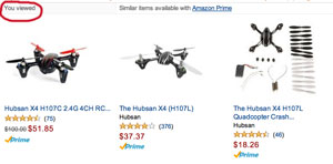
Recently Viewed: This is based on tracking the session history of the visitor.
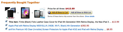
Also Liked/Purchased: This can either be set up dynamically, to actually suggest products based on their association with other products in the shopping carts of site visitors… or it can be set up to pull items based on tags.
Frequently Searched: This is based on the history of searches performed on the site.
Top Rated: This is based on user feedback such as star ratings.
Breadcrumbs consist of a string of links that typically shows up at the top of the page, just below the header navigation, or at the bottom of the page, just above the footer. The breadcrumbs show the direct link path genealogy that would most directly take the visitor back to the homepage. Typically breadcrumbs will look something like this:
Home > Category > Sub Cateogry > Current Page
Each step along the path would be a live link with the page name as the anchor text. This is a very good strategy for ensuring that the top level pages of the site receive adequate link support from the rest of the pages.
So, now that you have devised the perfect plan…
Let’s make it happen!
Next In the next lesson we are going to talk a bit about how to divide your project into phases and tackle things based on sensible prioritization. Let’s talk about